
Fortress Financial
Discovery
Fortress Financial is a start-up based in North West London where they assist their clients with mortgages, wills and protection needs. At the start of 2023, the founder reached out to rebrand the company as their old identity was no longer represented the company values.
Define
The client had approached us to help redesign his new logo for the brand as they were going through a name change. We discussed more about his business and where he would position the business against competitors.


Ideate
We further spoke about his brands values and the messaging so these can be evoked through the brand. We put together a few moodboard options to see which one the client was drawn to before we started sketching out concepts.


Create
A few concepts were presented to the client. We went through each mark and how it relates to the brands values and went through the colour palette options and font selection.
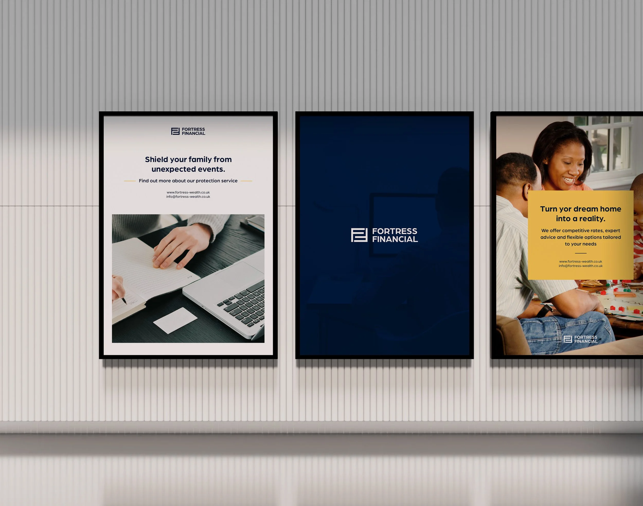
The final logo included a Midnight Blue, which was drawn from the previous identity maintain clarity and trustworthiness with the new and old logo. To keep the palette bold, we introduced the Golden Yellow and Washed Grey, which provides a corporate yet playful palette.

Implement
The rebrand entailed a fresh and adaptive identity that can be used across multiple touch points, specifically for marketing collateral. The new identity portrays confidence, trustworthiness and security by closely stacking the two ‘F’s’ in the logo icon. To tie the whole brand together, we’ve paired the logo icon with a clean and modern geometric sans-serif font.

